
Chart of the Month: Is the market over-valued?
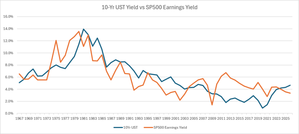
This chart plots the historical yield on the 10 yr U.S. Treasury (USTY) against the earnings yield of the S&P 500 (SP500Y). The earnings yield is simply the net income of the S&P Index divided by that index’s value. Our chart’s data is reflective of August 18, 2026. The USTY is considered the safest of all investments and is often referred to as “risk-free,” on account of high certainty of interest and principal payments. The SP500Y should be higher because the stock market is riskier, as history has shown in 1929, 1999, and 2007, where the losses we staggering. The risk premium should be rewarded by a higher return (or yield).
As you can see, the the SP500Y is now lower than the USTY. Many times this has foreshadowed a drop in the stock market.
Conclusion: Either the USTY will fall or the SP500Y will rise so that the risk premium is reflected properly. Based on the elevated inflation rate in the United States, along with deficit spending, the likelihood of a drop in the USTY is low. Therefore, our analysis suggests a drop in the stock market is more likely in the near term.
–CTK, Editor-in-Chief
July 2026
Consider please leave a comment below
Chart of the Month: United States Budget & US GDP
Chart of the Month: the Deficit
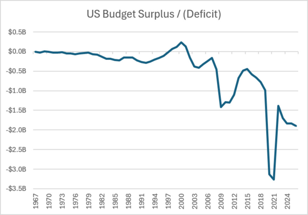
If you applied to rent an apartment, the landlord would review your paystub because he or she is keen to feel comfortable that you will have enough income to pay your rent. Knowing that you have other obligations to pay each month, the landlord wants to see how much cushion you have. Using the 1/3 rule, your rental payment should be no more than 33.333% of your earnings. Why not view the United States Treasury the same. Consider the current spending deficit of $1.9B. This amounts to a 5.8% budget shortfall relative to the GDP of the United States. It does not seem to onerous, until one considers the dismal trend, as shown above. Could there be a time when the bondholders decide to no longer rent their money to Uncle Sam? Would the US Treasury be forced to print money to cover its debts? If so, it would suggest elevated rates of inflation or spending cuts. Our outlook is for the former. Expect inflation to run hotter over the next 30 years.
CTK, Editor-in-Chief
August 2026
Chart of the Month: Continuation of a Theme. Is the stock market correctly valued?
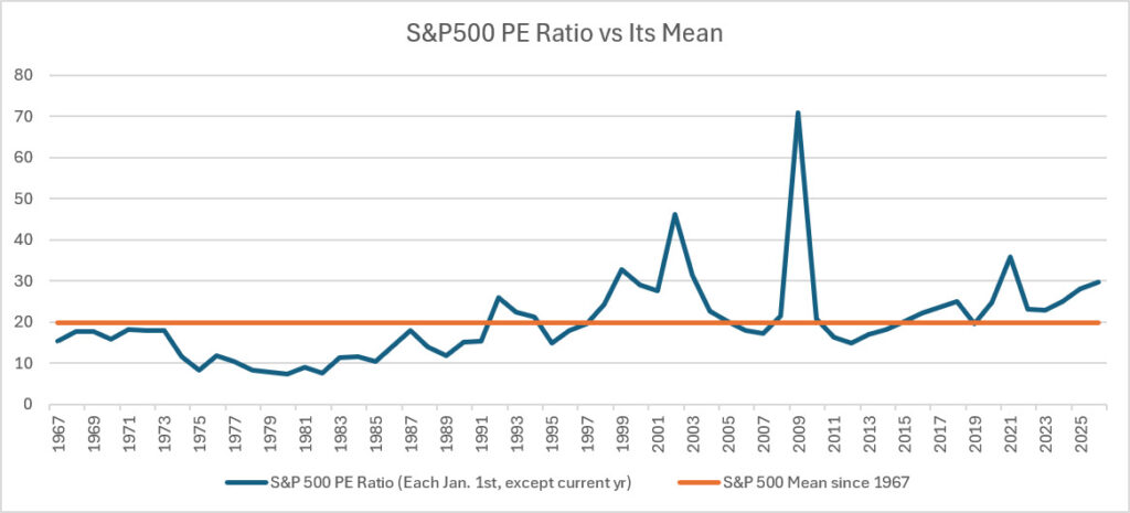
Today’s chart shows how today’s stock market valuation compares to the historical average. The y-axis is the S&P 500 mean and the x-axis is starts in 1967. By this metric the stock market suggests it is over-valued, but not at unprecedented levels. We expect the market to return to its average value in the near term. This means either an increase in the S&P 500’s earning, or a decrease in the stock prices that make up the index. A buy-and-hold investor should continue to do just that, but someone in retirement may consider a shift to a more conservative, diversified portfolio.
CTK, Editor-in-chief September 2026
It’s Time to Discuss Gold
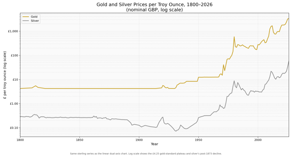
As the above chart demonstrates, the price of precious metals has increased since the US Treasury stopped backing the dollar with gold. No with no limits, the Treasury was able to issue dollars at will.
Leave a Reply